
UX research
Some of the decisions behind the desktop, the floating bubble bar and, for example, Edit’s tabs sitting at the bottom of the window, are not just taste. They come from a small attention study run while the desktop was being designed.
What we looked at
Section titled “What we looked at”The test ran across people of different ages, on devices of different form factors and screen sizes. The question was simple: once someone has found the window they mean to work in, where does their gaze land first, and where does the scan for what they need begin?
What we found
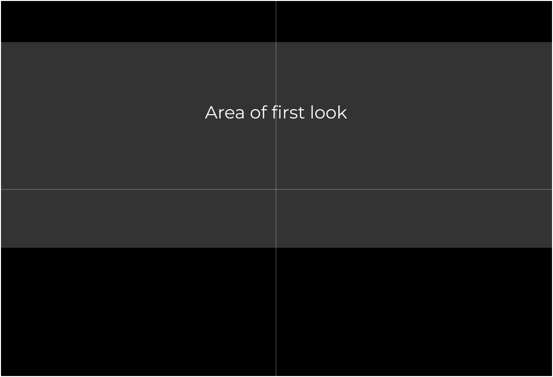
Section titled “What we found”For most people, the eyes fell into the same region: a band that begins a little below the top of the screen and reaches down to just past the middle, roughly a quarter of the screen tall. Sometimes a little higher, sometimes a little lower, sometimes dead center, but almost always in that band. This is about the screen as a whole, the map of the monitor, not any single app.
What it meant for the design
Section titled “What it meant for the design”A single top bar, the panel, is not a problem. It is one predictable strip, and the eye reads past it. The issue is stacking more chrome on top of that. Adding a titlebar to every window pushes the real content further down and, potentially, away from that natural focal band, asking you to move your eyes off the spot you already landed on just to find what you came for.
So the design tries not to spend that zone on chrome. That is the reason the bubble bar exists: keep the controls to small floating pills at the margins, and leave the focal band for the content. It is also why Edit puts its tabs at the bottom, below the code, rather than across the top. The few pixels at the top of the window are exactly the ones the eye reaches for first, and they go to your work.
A note on the study
Section titled “A note on the study”This was a small, informal study, not a formal paper, and it is a guiding signal rather than a law. But it held consistently enough across ages and devices to shape how Singularity treats the top of every window.